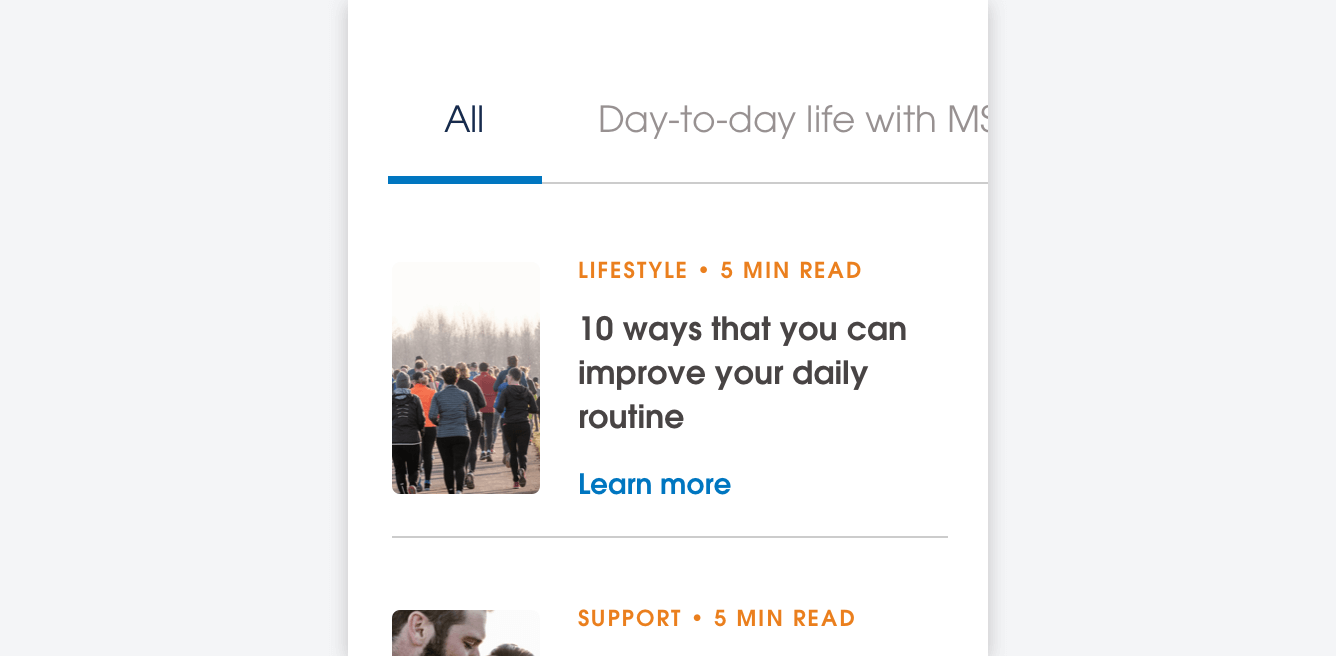
Tabs
Tab components are used to tab between different types of content. A Tab component consists of three states: inactive, hover and active.
Use guidance
Tabs are an easy way for a user to differentiate between two different content types of similar importance. They are an effective way of splitting up content without a strong leaning towards a specific content piece. They should be used as a method of inter-page navigation, and not in any other context. The use for a Tab should not confused with the use for an Accordion — Tabs should only feature in a single instance and towards the top of a page.
Use Tabs to differentiate between content of similar importance on a page
Use a maximum of one Tab component per page
Feature multiple headings in a single instance of a Tab component
Use more than one Tab component per page
Use Tabs in a main content area where an accordion or other components are better fitted
Feature too many elements within a Tab (6 maximum)