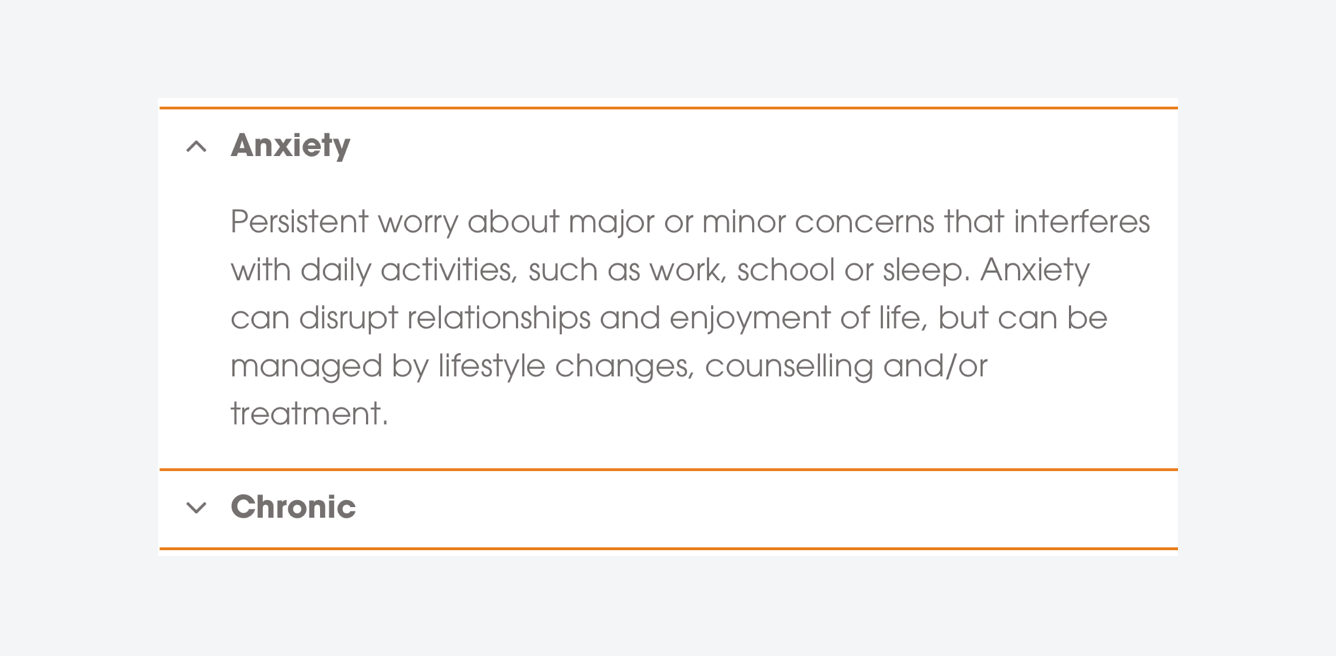
Accordions
Accordions are collapsed components which expand/close on user interaction. They can be used to facilitate content which is best received in a segmented fashion.

Use guidance
Content Accordions are used to house more detailed, in-depth pieces of content. The header is used to expand/close the accordion as well as the chevron situated on the left side. Content Accordions should be used to help streamline content for users and to allow for a better inter page navigation experience.
Use to show/hide important content, allowing users to naturally & easily filter through content
Use multiple instances in a list format to provide a user with options
Use to divide blocks of content into individual, considered subsections
Use to hide long pieces of inaccessible text content. Consider breaking up with other formats instead
Use a subsection Accordion within a main Accordion element
Have too many different options within a single instance of a Content Accordion (e.g. 8/9+ divisions)