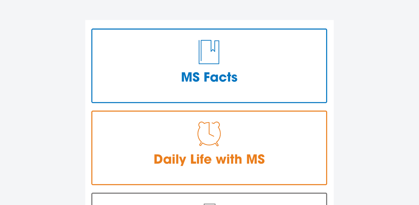
Hero Cards
Hero Cards sit below the primary Hero component. The structure is built up of a centered text header and an icon. They can appear in multiple colours depending on the brand. On hover, the cards changed from an outlined state to a filled state. There should be a minimum of 3 individual Hero Cards.
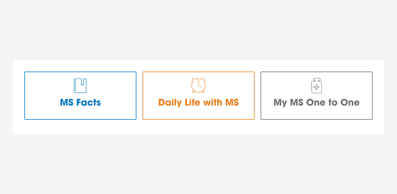 
Use guidance
These cards are intended to give the user a concise set of considered options to aid them with their journey. The cards should link directly to high-traffic content and should also consider different use cases for the given website.
For example, some users may be new to the condition, others may have experienced symptons for years. In this case, the use case for a given website is noticably different.
Direct to in-demand, high-traffic content to help a user’s journey
Consider at which point in their journey a user may be and how these links can help
Keep headlines concise and informative
Use this space for promotional content
Feature more than 4 cards in an instance
Crowd the cards with lots of text
Use inaccessible brand colours