Form
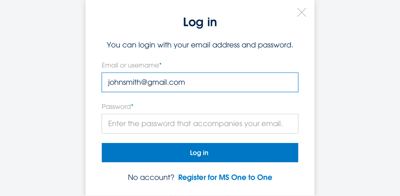
Forms are used as primary text input fields across our sites. Forms have 3 different states: unfilled, focused and filled.

Use guidance
Forms should be clear and obvious to a user. They should be clear text entry fields with an instructional label specifying the required information. Accessibility should be considered here. Focus states should always remain active as well as error states.

Error states
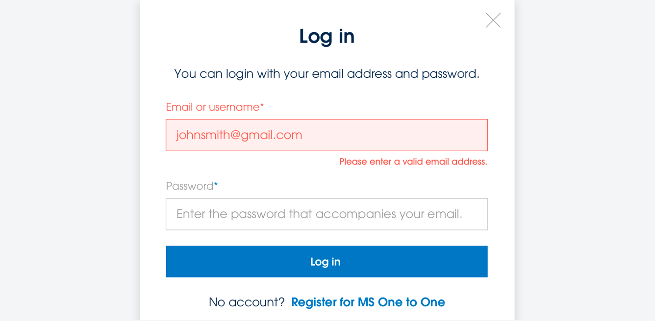
When an invalid entry has been entered into a form by a user, the relevant text field and label should change to the Action Red colour. A smaller line of text should appear underneath the relevant field specifying the error to the user.