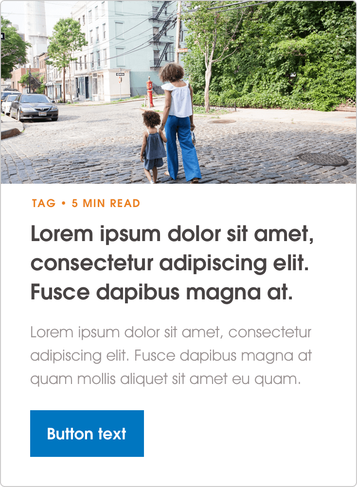
Content Card
Content cards are constructed of a thumbnail image, headline, body & button elements. They are used as navigation elements which link to different parts of the site.

Headline: Maximum 80 characters. Body: Maximum 117 characters.
Use guidance
Content Cards are intended to provide quick details to users, providing them wih the ability to navigate around the site with ease. To support this, text content should be simple and minimal, as adding too much copy will negatively affect usability. On mobile view, this component turns into a horizontal carousel.
Cards can be used individually or in a row of 2/3. 3 cards is the maximum number of cards per row.
Recommended Content
Use guidance
The Recommended Content component is built up of Content Cards. The primary difference between this state and the other state is the elevated background surface to draw emphasis. This component lives at the bottom of content pages and serves to guide the user on to another relevant section of content, aiding their overall user journey. As with the above component, the mobile view utilises a horizontal carousel.