Buttons
There are multiple different styles of button with different use cases for each. Buttons are used as primary devices to link between content pages. Buttons may also stretch to longer widths if needed.
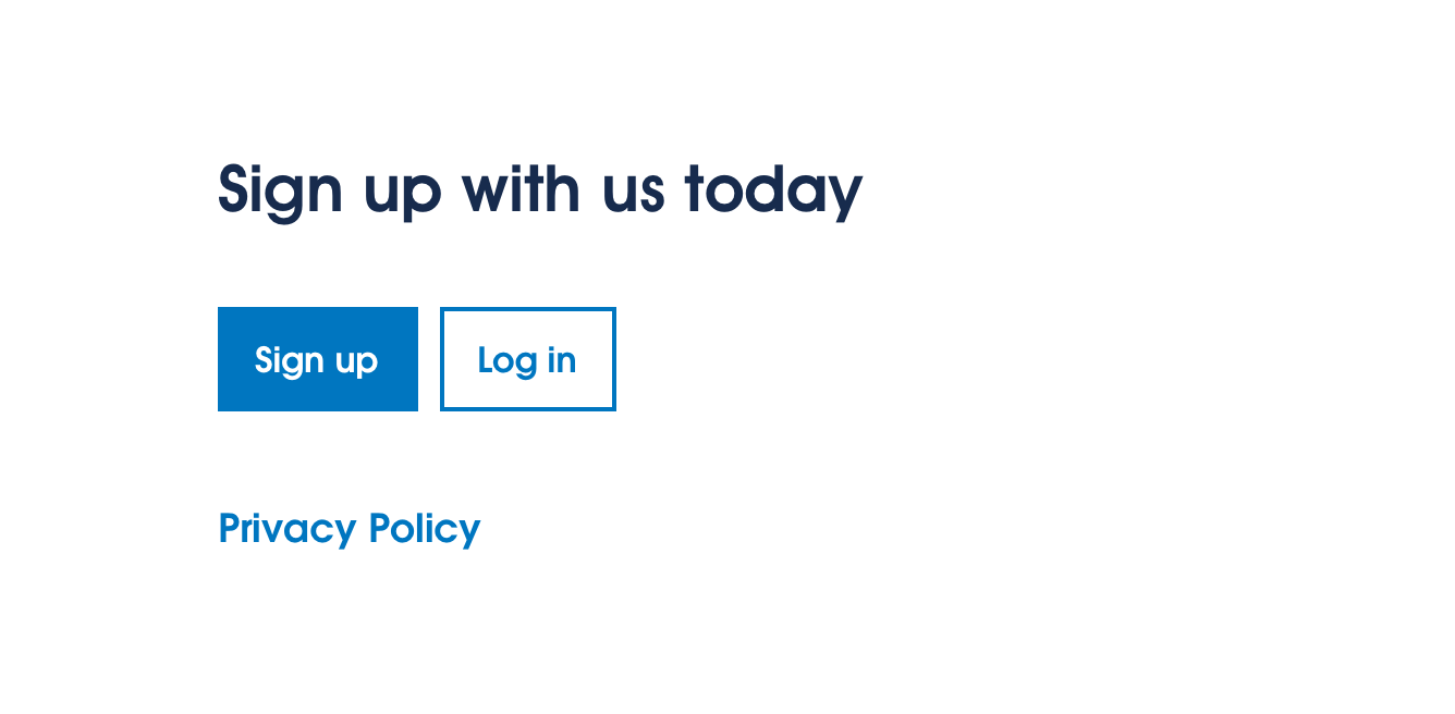
Primary button

Use guidance
Primary buttons are to be used for regular/strong call-to-actions. They are the default style of button type.
Secondary button

Use guidance
Secondary buttons are used for less prominent call-to-actions. An example of this is a ‘Back’ button on a form. In the scenario that a Primary Button is already present and a second button is needed, the Secondary Button component should be used.
Text buttons

Use guidance
Text buttons are the least prominent call-to-action type. Text buttons should be used for lower emphasis call-to-actions. An example use case of a text button is following a paragraph of text content.
Icon buttons

Use guidance
Icon Buttons can be used in certain circumstances. They may be used for quick, simple actions which are intuitive to the user. For example: like, print, download, etc. Icon Buttons feature in the footer.
Examples of use
 Primary Button
 Primary Button / Secondary Button / Text Button
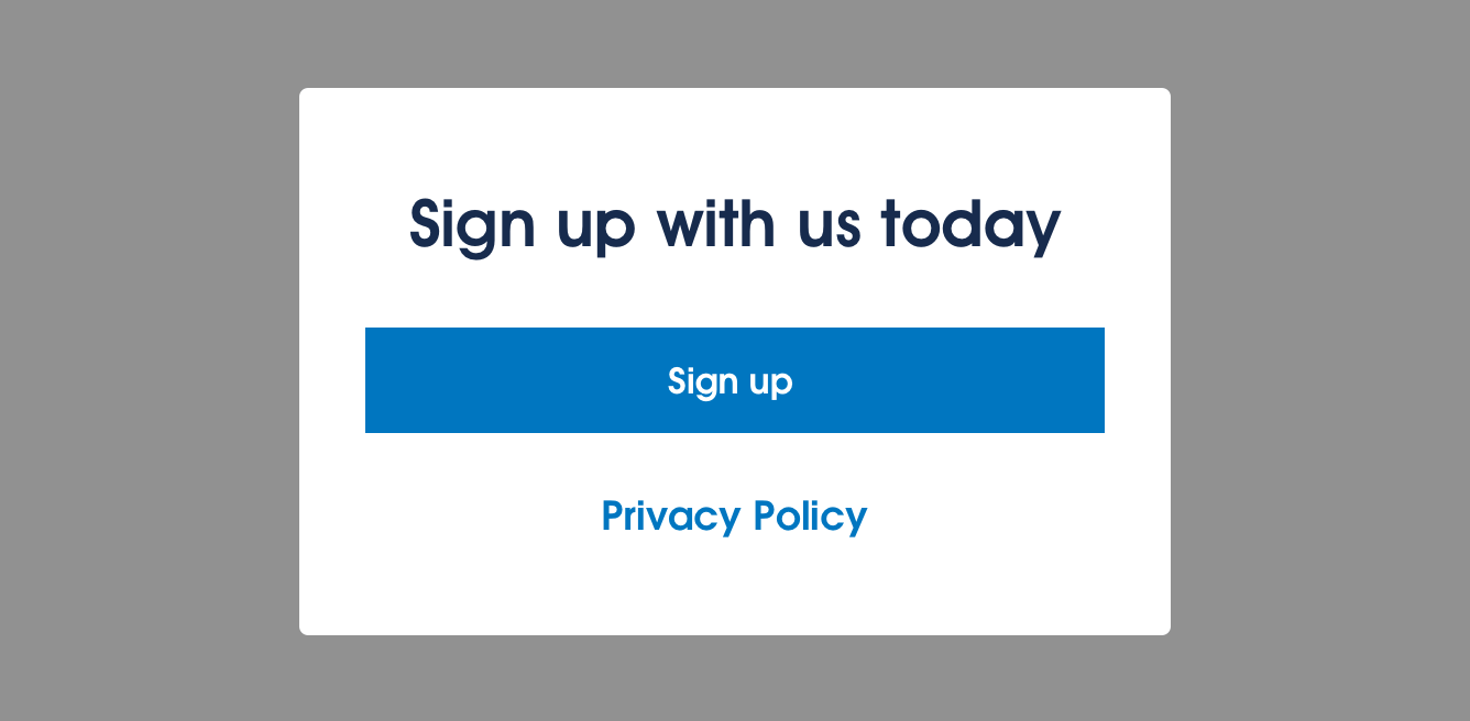 Buttons may also stretch to fill the desired width of components.